Today we are pleased to speak with Michele Sartori, founder of Sartori Ambiente, and Marco Fossati, mobility expert and rehabilitation technician, to share a special project launched in 2012 with the aim of bringing inclusivity to the waste collection sector.
The project? Making waste containers for separate collection recognizable by blind and visually impaired individuals.
Michele, how did this idea come about?
In 2012, the Municipality of Forlì launched door-to-door waste collection, distributing containers to all households. In this context, the Italian Union of the Blind and Visually Impaired approached the Municipality to ask how visually impaired individuals could recognize the correct containers.
This marked the beginning of a collaboration between the local government, the Union, and Sartori Ambiente to provide a practical and inclusive solution.
Mr. Fossati, your contribution was key. How did the idea develop?
I was already collaborating with the Italian Union of the Blind and Visually Impaired and was involved to provide technical support. The working group—comprising the Municipality of Forlì, Hera, and Sartori Ambiente—formed in a very constructive atmosphere.
It was immediately clear that Braille alone wouldn’t be enough, as it is known only by a portion of the visually impaired community.
So how did you arrive at the final solution?
We worked together to design tactile symbols that could be understood by everyone—a true design for all approach, in line with the principles later codified in ISO 24507:2021, which promotes the use of visual elements for universal accessibility and comprehension in information systems.
Each symbol consists of:
• a raised pictogram representing the type of waste
• and the initial letter in Braille, chosen among the most internationally recognizable ones.
For example, the symbol for paper is a raised swirl resembling a crumpled paper ball, paired with the Braille letter P for Paper.
The symbol for organic waste features three raised dots, like cherries, along with the Braille letter O for Organic.
Once the symbols were chosen, what other aspects were taken into account?
It was essential to define dimensions, thickness, and spacing to ensure proper tactile perception. Only after multiple tests were the final tiles created and applied to the containers.
Were the containers only distributed to those who needed them?
No, and this was the most meaningful decision: all citizens received containers equipped with tactile symbols, without any distinction.
The project also had a strong educational value: it was introduced in schools through a workshop where both sighted and visually impaired students had to sort classroom waste using only the tactile tiles.
This choice now fully aligns with the European Directive on digital accessibility (EU Directive 2019/882), which came into effect in Italy in June 2025 and establishes binding requirements for inclusive design in public services and citizen-facing products.
Michele, wasn’t such an innovative project patented?
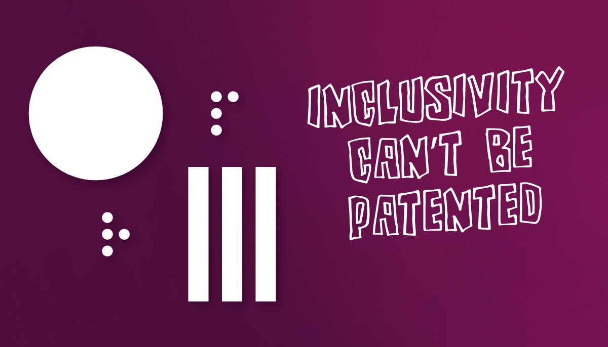
No, we chose not to patent it. From the very beginning, our goal was to make it freely replicable. If we want to speak seriously about accessibility, companies must be willing to share—not to hold back.
